Designing
for you and your
brand goals.
Branding for sunny coaches and entrepreneurs
who want designs that captures your client’s attention.


Does this sound like you too?
Does this sound like you too?


If you’re feeling stuck in a
creative rut... we’ll pull you out.
We have been there, and our clients too!
If you’re frustrated with how your brand looks swaying away all those potential clients, then you are in the right place, my yellow friend.
I’ll help you have a clear brand direction that will attract your dream clients. But how?
By A STRATEGY that works for you and your brand!
I can help you

FULL BRAND STRATEGY + IDENTITY
Full Branding Package
Imagine feeling confident in your brand because you have the clarity you need. In this package, we’ll craft your logo and branding that you and your ideal audience loves.

MINI BRAND STRATEGY + IDENTITY
Lite Branding Package
Perfect for small brands who want to build their client’s trust. This is for you– if you’re just starting your business, and want to have consistency in their visuals. (and also in a rush!)

ONE DAY VIP DESIGN
VIP Design Day
Delegate your long list of design work to us. Perfect for coaches and course creators, who wants to get design work done right (and on a tight budget). We are happy to serve you with premium course designs you need PRONTO.
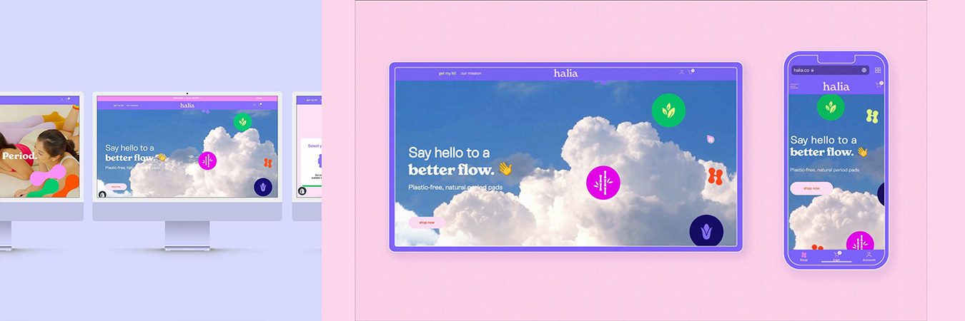
Take a peek at some of my recent projects
Happy Clients after working with us

“I will never stop recommending you!”
I wish you all the best and I will never stop recommending you!

“We got a lot of positive feedback from our audience saying they loved the new logo”
I like that you communicate well with us, keep us posted and that the end product comes out better than what we imagined.


Meet your design bestie
Yello, I’m Pau and I love all things yellow… and that includes sunny people like YOU!
As your bestie, I’ll help you design the brand of your dreams.
If you’re looking for a brand designer who
💛 so easy to work with (just like talking to your best friend)
💛 loves hearing all your ideas and turns them into reality
💛 makes designing fun
💛 understands your business like you do
💛 wants the best for you and your brand
then we should talk.
Grab your editable template to make your course program shine brighter than the rest!

Ready to feel more
confident with your brand?
You need some Yello on your feed 😎
Let’s connect on the ‘gram!
We love to stay inspired, and now, we’ll get to see YOU.


